The pandemic has inevitably brought a seismic change to new internet users, including senior citizens and those from less privileged communities who were previously technologically “disconnected. “Around 40 percent of the world’s population now has access to the internet. Interestingly, however, only 36% of those in the low-income communities have access to mobile technology Whereas, there is a startling 40% gender gap in how men and women have access to the internet and other technology devices due to pay gaps and cultural mandates in some of the developing countries.
The 3 P’s impacting the digital divide among internet users include:
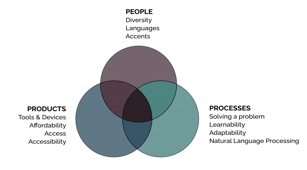 The increased adoption of smartphones, improved digital infrastructure, and a supportive regulatory environment fuel the rapid growth of mobile technologies worldwide. Tech companies are widening their gazes beyond developed countries for their next growth ventures. Ubiquitous, affordable mobile devices and plans such as Jio in India are helping another billion users join the internet. Why are these users joining the internet bandwagon, and how are they the same or different from the current internet users? The key phrase is “Global expansion through inclusivity. “Google’s technology defines the principles behind building globally accessible products and offering practical resources, especially in emerging markets such as India, Indonesia, Brazil, and Nigeria. However, mobile and technological affordability is lower than in countries like the US.
Next Billion Users Overview
The top 10 countries with the highest numbers of people not connected to the web are given below.
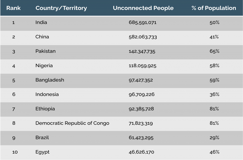 You can view other essential statistics on internet usage here.
UX designers today need to optimize websites and apps differently for those not digital natives, have no digital experience footprint and use low-cost devices. It also means that they must consider having internet access via an older or low-end phone, varied environments for users with disabilities, and when the network is slow and unreliable. Therefore, a pertinent question to ask is, “What would it be like to use digital interfaces in such conditions?”The following factors will influence app designs as a part of the global accessibility framework under the NBU technology.
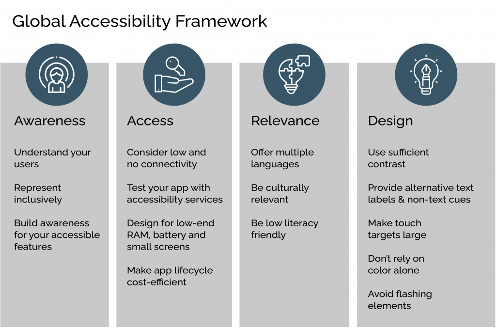 At Radiant Digital, we design in a device and environment-agnostic way where the Next Billion users benefit from affordable technology accessibility. This blog discusses the key design considerations for the Next Billion Users.
Why design for the NBU?
We talked to Rachel Simpson, senior designer on Google’s Chrome UX team, to determine why designing for the NBU is crucial. Rachel was instrumental in making Chrome work well for the NBU and has primarily focused on India. She said that in India’s emerging market, technology companies promote inclusivity and develop solutions by considering:
- The number and growth rate of the internet-connected population.
- The shared characteristics of those users.
The opportunity is massive since the growth rate of global technology users has flattened out at 9 percent annually, and the bottoms-up innovation has led to the creative remix of technology usage. Moreover, this growth rate is accelerating and poising developing economies to adopt internet technologies and devices faster and economically. According to Mary Meeker’s Internet Trends reports in 2016, India surpassed the US to become the second-largest internet usage market globally, after China, in 2016. Still, it also leaped from 277 million users in 2016 to 355 million in 2017. IAMAI-Kantar Cube reported that India’s number of active internet users is likely to hit 900 million by 2025 compared to 622 million in 2020. Moreover, by 2025, this number in rural India would surpass urban India. Given the growing digital ecosystem, UX design will need to evolve to address the specific needs of this emerging demography. With NBU, removing the following barriers will be the top priority for designers.
- Technological
- Accessibility
- Affordability
UX designers need to factor in the following when they design and test for progressive applications.
- No installation or update costs.
- No Storage issues.
- Support for PUSH notifications and offline functionality.
- Default support for Maps, YouTube, and other useful apps in entry-level devices.
- Accessibility for users with situational, temporary, and permanent disabilities (vision, hearing, motor, cognitive, speech).
The Three C’s that influence UX for NBU
Cost: Low specification devices standard in emerging markets have less built-in storage available at higher data costs. Therefore, designers need to collaborate with engineers in building lightweight and agile apps that consume lesser data.
Connectivity: Users in emerging markets experience more connection errors, interruptions, and low speed. Building progressive web apps that consume less storage and load fast even over 2G connections and offline modes. In addition, designers must create graceful degradations for users who don’t have a stable network connection.
Complexity: Keyboard UI complexity is more for mobile users compared to desktop users. Language and OS barriers also add to the complexity. It is crucial to design for simple text strings and pair culture-oriented iconography with text to promote comprehension. Progressive enhancement and performant CSS are game-changers in designing for less complexity.
NBU Design Best Practices
Here are some design guidelines to help build apps for a huge population untouched by technology and can be the potential users among the NBU.
Use Permanent Object Positioning: For new users, it is essential to allocate spaces within the screens for certain types of actions. Assigning specific screen locations for positive actions like Save, Submit, and Confirm and negative actions like Delete, Cancel, Reject, etc., is essential.
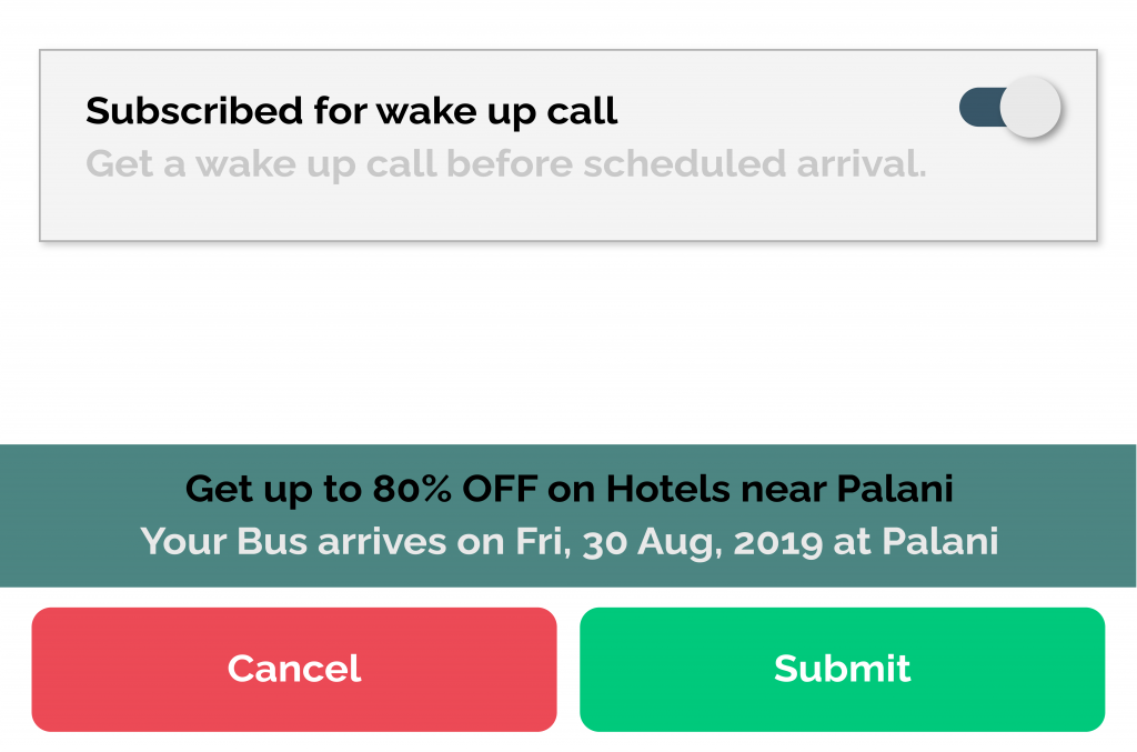 This standardization helps build muscle memory for specific actions, and using new apps or devices becomes more effortless.
Avoid Scrolling: Scrolling would not be intuitive for new users. It is recommended to place all the information on multiple screens and provide navigation buttons instead. Thus, providing scroll hints and ensuring that the data is not “cut” exactly where the physical screen ends.
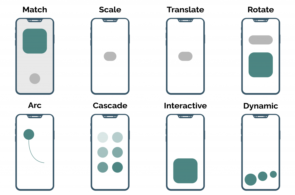
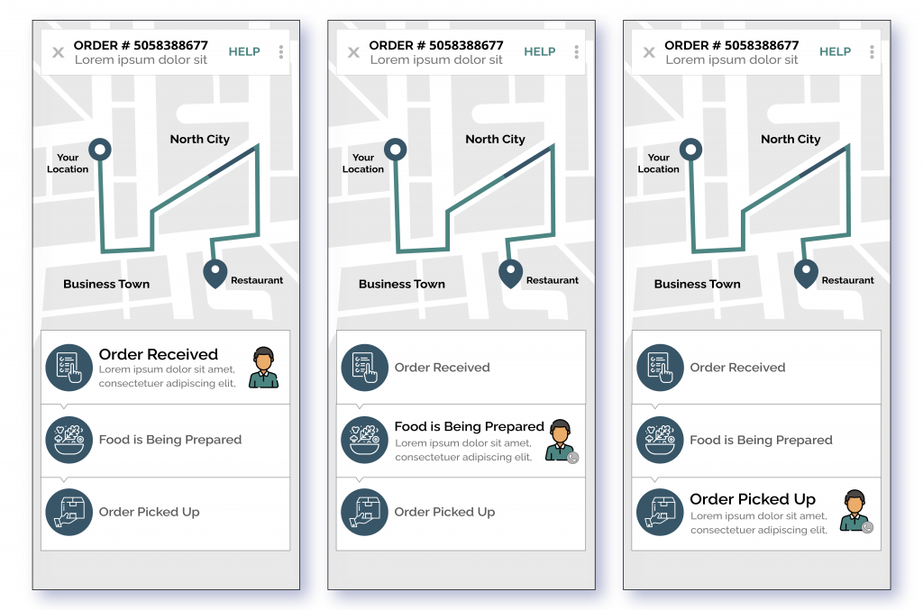 Use Elegant Screen Transitions: Using transition animation when switching between screens will help users understand that a new set of information uses the same space. However, designing a quick switch between screens doesn’t allow users to switch contexts seamlessly and confuses a new user. Here are different transition types that you can use.
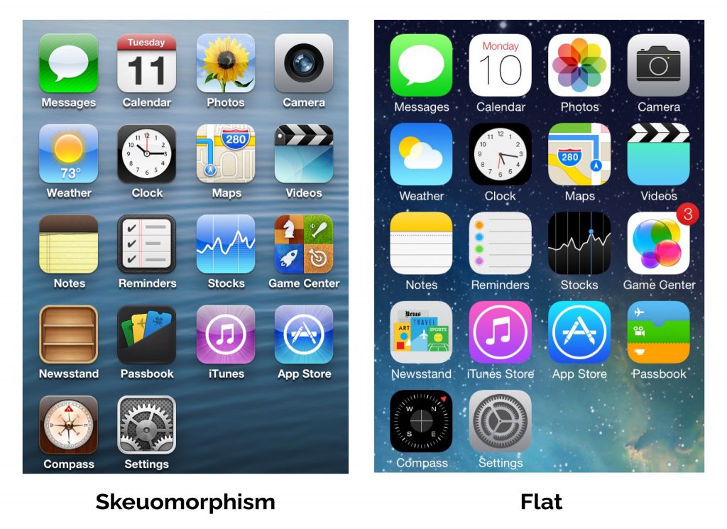
 Use Skeuomorphism: This means that the interface should use real-world object depictions like icons for delete, erase, draw, etc., instead of using vague names or references like “x.”
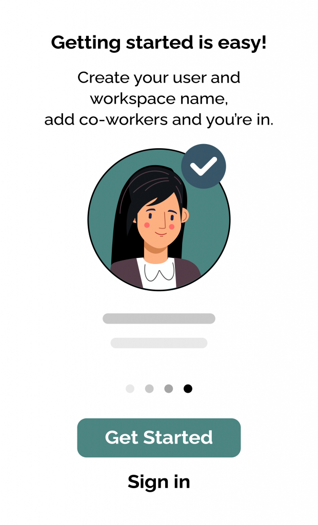
 Build User Confidence: This is important for novice digital users, especially on finance or monetary apps. A design should let them know how to use an app to perform and complete a task and its steps. For example, messages, notifications, or conversational text like encouragement or help questions will help users make decisions and take actions more confidently on an app.
 Wrapping up
Are you designing with emerging markets in mind? Radiant Digital’s stellar UX design team can help you explore and tap into the new opportunities offered by the NBU. So let’s connect and get talking!

