The definition of A/B testing
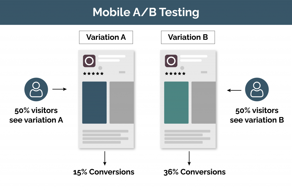
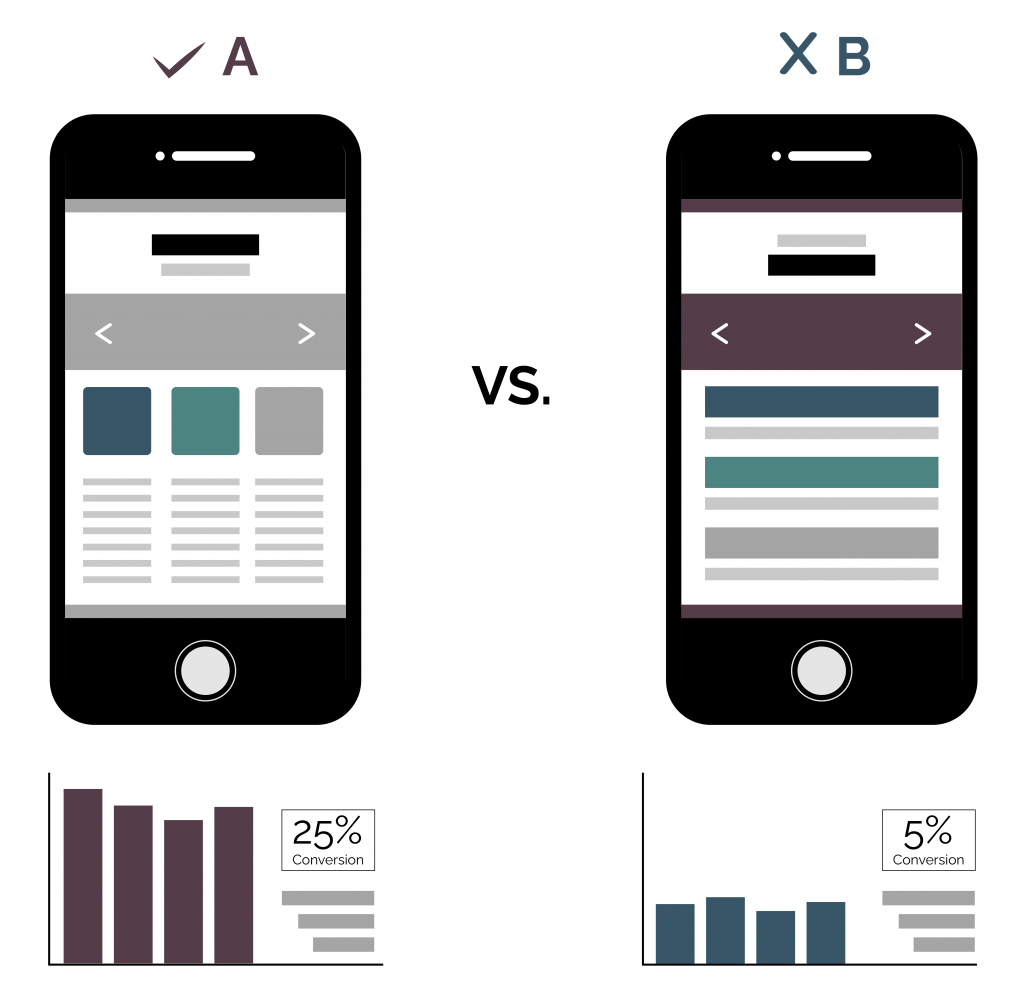
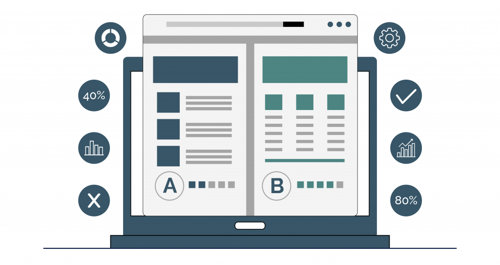
A/B testing is another name for split testing. It’s a method of comparing two different versions of a website, app, or others by testing to see which one performs the best. In short, it’s an experiment where two pages that differ are shown at random and undergo a variety of tests to see which one not just looks the best but which one also performs the best. This is great for ensuring you only show the best version to your users. A lot of the time, when modifying websites, there is a lot of estimating undertaken as to what would be the best. This type of testing ensures that the changes you are making are backed up by research.

Terminology: The original version is identified as ‘the control’ while the alternative is called ‘the variation.’
Why is this type of testing used?
There are many benefits to A/B testing. Through a controlled process, individuals can tweak or completely change certain aspects to see results. In addition, the data collected from testing helps implement further modifications to other sources to enhance user engagement. Furthermore, this approach can help ensure all team members are on board. Designers may have opposing viewpoints on what will perform the best. Therefore, this method helps provide quantitative data to show real-time evidence of what direction to go. The main advantage of using this approach over alternatives is the ability to heighten your control. Single words can be altered if necessary to examine all possible modifications that will help gain the desired outcome.
How to use A/B testing
When using A/B testing, the source you want to analyze is selected. Whether this is a web page, app screen, digital advertisement, etc. An alternative to the original is created. This version includes noticeable differences. The amount of variation on this depends on you. Once the sources have been finalized, all traffic is split evenly between the two versions. Analytics is then used to identify different trends that emerge. The results from the test present three other possibilities:
- The new version increases ROI.
- The new version decreases ROI.
- Little to no impact.

Performing the A/B test
There is an extensive range of different possible variations that can be tested. Whether on a website, app, email, or anything else you want to try. Every time a potential customer visits your website, for example, you have the potential of converting them. Because of this, you need to test the critical parts to ensure it has the best chance of success.
Engaging headlines
As soon as someone visits your page, they look at the headline, which is usually one of the first things—because of this, making the headlines as engaging as possible is critical. Therefore, A/B testing is an excellent idea to make them as short, catchy, and captivating as possible straight away.
Don’t just play around with the content. Look at different font and color styles to decide the best first impression for your potential customers. This doesn’t just apply to websites and apps. For example, when creating email marketing campaigns, use A/B testing on your subject headers to find the most effective way for converting leads.
Straight to the point text: The body text should state precisely what the visitor will get most shortly and interestingly possible. Once again, testing is necessary because you are more likely to see a significant increase in conversions if the text is captivating. Use this test for content adjustments and to change the formatting. For example, by changing large blocks of text into smaller, easy-to-read paragraphs, visitors who like to skim-read are more likely to look at the content.
Providing high-quality UX design: An easy-to-use website or app makes the difference between a visitor staying on a page for longer or moving on and leaving the site. The best way to ensure a user is delighted with their UX (user experience) is by performing A/B testing to find how to create an excellent UX best.

Navigation: Straight forward navigation can distinguish between users guiding through your app or website quickly or leaving in frustration. A/B testing helps determine how the audience navigates and what should be changed to increase funnel potential.
A persuasive call to action: The call to action is one of the essential parts of any digital transformation strategy. This is where the visitor should be persuaded by what they’ve seen, resulting in them becoming a customer. By implementing A/B testing for a call to action, you can decide on the content and placement of the CTA that will have the best results.
How to avoid mistakes
Some businesses become carried away when it comes to testing all products or apps. This can be counterproductive as non-important factors could be taking up valuable time during development. Therefore, to avoid this, a relevant hypothesis must be used to determine if the item in question is worth testing. An excellent place to start is to look at any analytical data that already exists. For example, conversion pages are identified quickly and can be tested correctly to increase results.
Challenges to outcome
When A/B testing is implemented into the designing phase, it’s not always smooth sailing. However, there are specific challenges that all businesses face when using this improvement tool.
Audience differences: Sometimes, knowing the exact target market can be hard to identify early on. It may change significantly to what was visioned. If that happens, the initial design stage that used A/B testing may not be relevant later on.
Understanding data correctly: The whole point of this method is to gain quantitative feedback that provides an insight into the best product or app to use. Therefore, all measurements acquired must be looked at closely to support the right decision.

Getting started
Want to learn more about A/B testing? Our UX experts are available to discuss how this approach can help achieve your targets. At Radiant Digital, we’re always looking to enhance businesses’ digital transformation strategy without the fuss.

