Modern-day brands have realized the need to leverage mobile channels to innovate and attract more users. However, that is not enough. Businesses need to design and develop complex mobile apps with simple yet effective UI that delivers a seamless user experience. In addition, UX designers need to consider the critical UX components of complex applications that consume more resources than typical applications.
Overview of complex applications
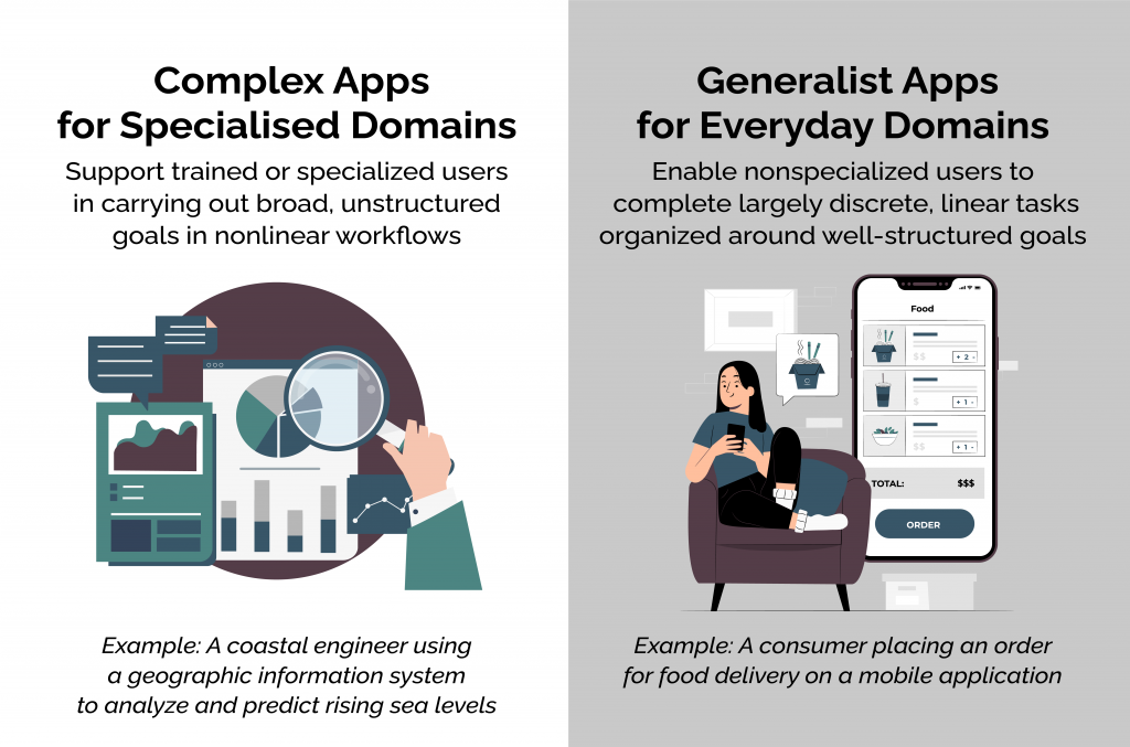
A complex application is any application supporting broad, unstructured goals or nonlinear workflows. It allows users to accomplish overall and structured objectives and is designed for specialized domains. A specialized domain is a field that needs immense and technological expertise. In simple words, working in such a domain requires recursive and precise decision-making. On the contrary, general apps help users to execute linear tasks structured on well-defined objectives.
How do complex apps differ from general apps?
Complex apps often deal with accomplishing nonlinear objectives without a pre-defined workflow for task completion by trained experts. For instance, an engineer has to analyze the reason behind high spikes in bandwidth usage. On the contrary, general applications usually rely on linear and discrete tasks for pre-defined objectives.
 Features of complex apps
You can make the UX design of a complex app more engaging with these features.
- Complex apps support the needs of well-trained users who have expertise in specific domains.
- They help in solving specific and more complex problems that vary based on the defined workflows.
- Complex apps allow users to manage and navigate large data sets using Analytics to aid better decision-making.
- Complex apps apply system intelligence to mitigate risks when high-impact or high-value tasks are performed.
- Complex apps integrate easily with existing systems and communicate seamlessly with existing enterprise tools and platforms.
Types of complex application users
Designers cannot change application workflows to be less complex. What complex app users need to do is difficult for designers to understand, especially all the users’ nuances. But, what designers can do is make the applications look less complicated for the different user groups. Different complex application users have their distinctions designers need to target them differently based on each scenario. These users include:
- Learners
- Legacy users
- Power users
When the context is about learners trying to access the complex app, the designers should simplify learnability and streamline the UX. The app should be easy to use for learners. For legends, otherwise known as power users, the app must be designed as efficiently as possible to make working easy and productive. This typically involves task automation and workspace customization. For legacy users, designers should integrate the app with good design elements and communicate its value. Legacy users often navigate bad experiences or are taught how to do something incorrectly rather than efficiently. Designers need to communicate the value of their design decisions to legacy users and ensure they have a good experience.
Importance of learnability for complex apps
UX designers can reduce the learning time of complex apps for users by promoting learnability and through user training using these methods.
Spatial predictability: This method helps create more learnable interfaces and orient users within the app. If the location of common functionality changes between different pages, it can cause issues. Designers have to allow users to explore the application safely. There’s a paradox where people are motivated to start using apps rather than learning about them or setting up parameters.
Discoverability: Discoverability fuels self-exploration. Designers need to uncover complex functionalities to users progressively. After learning the initial toolset, users will understand doing things and can improvise to do it faster.
Visual salience: Visual salience is integral to discoverability. For instance, creating guided navigation relevant to work during complicated workflows is an ideal example of visual salience for discoverability. One thing to be factored in by designers is that the users must quickly move back and forth between navigation steps.
Notetaking and navigation: A makeshift external memory often plagues users who need information (excel sheets, workflow steps, or sticky notes) to execute the actions in a complex app. Allowing for notetaking within the application eases the workflow because it doesn’t require the user to reorient themselves into the application. For deep applications with many functionalities, users need to know where they are and quickly return to the home screen. Having a side menu with the application hierarchy is one example of doing this.
Naming icons: One of the essential things is to name icons that are not universally known in the application. Of course, designers can always include a setting to disable them once the user has learned what the app has to offer and its features. But until then, the extra screen real estate isn’t that important.
Accelerators: These include UI features that speed up user interactions on a complex app. For example, hotkeys help reduce unnecessary moves between different menus and dropdowns based on complex workflows. Additionally, accelerators can be placed in the central/sub-menu with the critical combo next to the function or hovering over icons. Finally, tooltip help reveals accelerators in the context of the action or through in-line support, which offers more information on the functionality and using it efficiently.
Flexible contextual inquiry: Designers should provide enough flexibility for users to operate on the app based on their goals and convenience. When in-person contextual inquiries are complex, using a webcam or phone positioned over the user’s shoulder or side helps designers view and note user interactions and frustrations in real-time.
Understanding what works and what doesn’t
Designers need to advocate for more user research from the start of the design cycle since designing something that doesn’t work in the real world is useless. Waiting to get a prototype ready for users will delay the design process while attracting unwanted rework or a complete overhaul. It is thus essential to creating training videos and virtual sessions with clients to thoroughly test your design, its functionalities and identify any gaps in the user’s environment.
Closing thoughts
For companies looking to rehash their applications or create new ones, involving your users early before any screens are made is crucial. Also, getting them to help during your usability testing is valuable since they are domain experts and can spot things that designers may overlook.
At Radiant Digital, we understand and design complex applications for different types of business users. So connect with us for the best recommendations today!

