Providing a positive user experience is inherently psychological, and the number of theories related to UX design reflects this. Choosing the right approach is far easier when understanding the behaviors that drive each idea. A strong background in the psychology of UX design makes balancing functional and attractive design second nature.
The Relationship between Cognitive Psychology and UX Design
Cognitive Psychology is the branch of psychology that thinks of the brain as a biological computer. It focuses primarily on motivation, problem-solving, decision-making, memory, and learning, all of which are important for UX design.
When navigating software, users are constantly running cognitive processes in their subconscious, and the outcome of these processes dictates whether they feel positive about the product. If they have difficulties with accessibility, navigation, or comprehension, they will have a less positive user experience. A basic understanding of cognitive psychology can prevent this and have a huge impact on the outcome of a service or product.
How Considering Cognitive Load can Enhance UX Design
The mental stamina needed to process and retain information when using a digital product is called ‘Cognitive Load.’ Each person only has a fixed amount of processing power, and demanding too much of the system can have unpleasant consequences.
Giving a computer too much to do at once will overburden the processing system and cause a dreaded computer crash. The same thing happens to the human brain if we try to make it do too much at once. This biological system failure is called Cognitive Overload, and if it occurs during the use of a digital product, it is unlikely to encourage the user to keep using it.
There are three types of cognitive load
- Intrinsic Cognitive Load is how difficult a task is to complete. Designers consider Intrinsic cognitive load when developing registration buttons, like ‘Sign Up, by removing all additional options and stimuli.
- Extraneous Cognitive Load is how non-essential issues affect the brain. Difficult typefaces or faulty micro-interactions all increase extraneous cognitive load.
- Germane’s Cognitive Load is the organization, construction, and implementation of learned behaviors, called ‘schemas.’ When learning a new process, the brain instinctively compares it to its already-known processes.
If users are faced with a complicated feature early on, they will likely feel overwhelmed or unequipped to deal with the product. Cognitive overload can be avoided by presenting users with small chunks of information. This process of breaking up news is called progressive disclosure and will improve the user experience.
Five Common Psychological Laws, Theories, and Principles in Design
1. The Schema Theory
As mentioned above, a schema is how our brains register and organize processes, preferences, and experiences. As we grow, we choose the methods of organization that we prefer and dislike things that vastly differ from our own experience.
If we apply this to design, we have to consider if the cognitive cost of learning a new schema will outweigh the benefits of having a distinctive or unique product. We don’t want to drive users away by trying to reinvent the wheel, or in this case, the hamburger menu. To avoid this, some companies decide that a safe, familiar layout is more worthwhile than investing in a unique feature that takes a long time to adjust.

2. Von Restorff effect
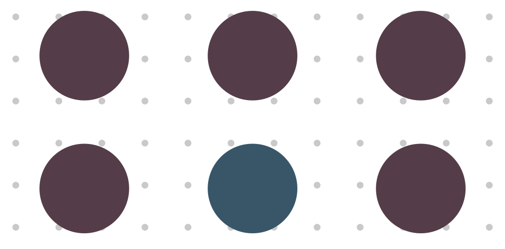
The Von Restorff effect suggests that users are more likely to remember an item if it differs from those around it.
It’s used to guide users to a function the designer wants to stick out, like notification bubbles, sale banners, and ‘Last One!’ warnings. Even a subtle change will attract a user’s attention, making this a valuable effect for designers aiming for a minimalist design.

3. The Gestalt Principles
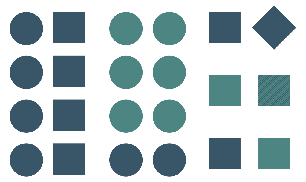
The Gestalt Principles are a collection of theories about human processing. Some of the most useful for UX Design include
- Continuation, or what guides the eye from one object to another. This principle can help UX designers direct a user through a digital product.
- Similarity and Proximity, or how our brains group similar objects. In design, this can highlight a preferred option using color, size, distance, and shape.
- Figure and Ground, or the fact that objects in the foreground of an image will be seen before anything in the background. Designers use this when they want to draw attention to a focal point, like an action button.

4. Hick’s Law
Would you instead scroll through a list of a hundred items or five? If users are looking for a single option, they’ll find having to search through myriad options frustrating.
Hicks Law states that the time it takes for people to make decisions depends on the number of options available. The time it takes to make a choice increases with the number and complexity of the possibilities. Here, simple is best.

5. Serial Position effect
When displaying items in a sequence, the serial position effect dictates that the position of the item on the list affects recall memory. Ebbinghaus, the father of the theory, found that users best remember the first and last items in a sequence.
By placing the most critical information first and last, with the least important information in the middle, UX designers can decide which information the user remembers.

In Summary
The limit to the application of these principles is dictated by the designer, but that’s not to say that every project needs to apply as many principles as possible to be successful. Instead, these theories should serve as useful tools for designers when considering how to approach a problem.
Get in touch if you’re interested in learning more about the psychology of UX design; our experts are always happy to talk!

